Mixam's Print File Checklist
Ensure you have checked the following before uploading your files to a pending order:
• Do all files include bleed?
• Are all files in CMYK color mode?
• Are all files the correct size?
• Do all files have the correct orientation? (i.e. portrait vs landscape)
• Does your page quantity match the number of files you’ve created? (i.e., if your book contains 48 pages, do you have 48 files to fill the pages?)
• Have you embedded all fonts?
• Have you designed files according to the binding?
• Is important content positioned away from the trim edges and binding line?
• If your files include page numbers, do they appear in the same position and in the correct order?
• If applicable, have you created a spine file?
• If applicable, have you created a separate layer in your cover PDF file for spot UV or foil and set it to ‘Overprint’ before uploading?
• If applicable, have you created a separate PDF file for a dust jacket?
Does Mixam print NSFW content?
At Mixam, we welcome a wide range of creative content, including most NSFW material. We’ll only reject your order if the material is deemed hateful, unlawful, threatening, or defamatory. While some of our print facilities may have their own restrictions, we’ll do our best to fulfill your order at an alternative location if necessary. Please note that you are responsible for ensuring you own the rights to the content you print, and Mixam cannot be held liable for any copyright or legal issues that may arise.
How To Prepare Files for Spot UV and Foiling
Upload one PDF design file with a separate spot UV or foil layer to your pending order’s Artwork tab.
Spot UV
In your design program, create a new layer and label it ‘Spot UV’. For visibility, set the spot UV color to 100% magenta and set it to ‘Overprint’. Overprint ensures that the spot UV finish is applied directly on top of your printed artwork.
For more information and setup instructions, visit our 'How To Apply a Spot UV’ support page and watch our InDesign Spot UV video tutorial and Illustrator Spot UV video tutorial on YouTube.
Foil
First, remove the artwork elements intended for foiling from your artwork file. This step ensures the foil adheres directly to the paper. Place the elements in a new layer and label it ‘Foil’. Set the foil color to 100% magenta for visibility. Supply your foil layer as a vector graphic (shape) with a 2 pt line width and no more than 1” of foil coverage for optimal results.
For more information and setup instructions, visit our 'How To Apply Foiling to Prints’ support page and watch our InDesign Foiling video tutorial and Illustrator Foiling video tutorial on YouTube.
How To Proof Your Print Files
Mixam’s advanced software will automatically check your files upon upload, but it’s also important to manually check them. Here’s how to proof your files:
• Large screen viewing: Review your files on the largest screen available so you can see your work clearly.
• Scale your files: Make sure your on-screen dimensions match those in print by scaling them to 100%.
• Calibrate your monitor: Adjust your screen settings for color clarity and to minimize screen-to-print color discrepancies.
• Avoid excessive brightness: High brightness can make colors appear more vibrant than they will in print.
Adobe Acrobat Reader
This free tool allows you to view and share PDF files. It’s useful for viewing your downloadable proof because it accurately represents how files will look when printed, preserving fonts, colors, and layout as intended. It’s also a reliable way to catch potential issues and make last-minute changes. Download it here.
Switching on Overprint Preview by default will also help to prevent color loss and mixed transparencies (overlapping colors or images of varying opacities that cause blending issues) if you include a spot color (used to specify and highlight individual page elements). Here’s how to turn on Overprint Preview:
On a PC: Go to Edit > Preferences > Select Page Display > Under Page Content and Information, the Use Overprint Preview dropdown menu, confirm or change to be set to Always.
On a Mac: Go to Acrobat > Preferences > Page Display > Under Page Content and Information, the Use Overprint Preview dropdown menu, confirm or change it to Always.
What is a downloadable proof?
This proof is the most accurate representation of how your files will appear in print. It will highlight issues that may not be immediately apparent and is available for download once every thumbnail in your Artwork tab has a file uploaded.
You can download this proof by either:
• Clicking the ‘Proof’ button > Wait for the checkmark to appear > Click again to open the Proof > Click the Download button.
• Right-click the Proof button and use the ‘Save As’ option to save your PDF file.
You can then view the proof in Adobe Acrobat Reader.
What is a professional proof?
This free proof type is a digital PDF that undergoes a detailed analysis called preflight to prepare files for print. It’s available for orders over $5,700; additional proofs are available on request at an extra cost.
We’ll email you to confirm when your professional proof is ready for review. You can edit it, and it will enter production once approved. If you reject it, contact us to explain, and we’ll help you prepare your proof for production and provide a new estimated shipping date.
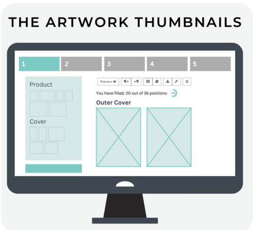
What are thumbnails?
These are not strictly proofs but are small, low-resolution depictions of your files. They’re ideal for checking your page sequence, layout and orientation. One thumbnail is equivalent to one page in your book. They will display bleed, trim and gutter guidelines, which you can turn on and off by clicking the ‘Show guidelines and legend’ box.
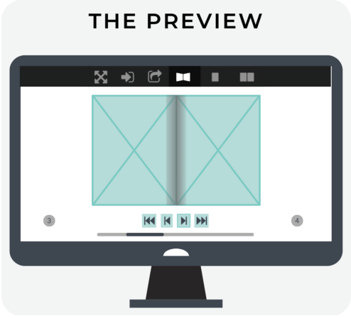
What is a virtual preview?
Upon upload, our system will generate a 3D virtual representation of your book in a flipbook format. It depicts your work in lifelike quality for viewing purposes only. This preview helps ensure that your page files are present and in the correct sequence. You can also share your virtual preview by clicking the Share button at the top of your screen.
How To Avoid Common File Issues
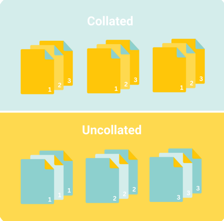
What is collation in printing?
Collation means printed pages are arranged sequentially and ready for binding. Collation speeds up the printing process and streamlines assembly. Without collation, pages would be printed in bulk, with all copies of page 1 grouped together, followed by all copies of page 2, and so on.
Here’s how to make sure you collate your files correctly:
• Check your settings: Confirm that collation is enabled in your design software before you start designing.
• Label files clearly: Use simple, sequential names like ‘page1.pdf’ to keep your files organized.
• Move pages manually: Once you’ve uploaded your files to the Artwork tab, you can rearrange them using the drag-and-drop function or by entering the correct page number using the three-dotted button.
• Use Design Online: Mixam’s free tool will automatically collate your book.
How do I create a spine design?
A spine is the edge of a book where the outer covers and interior pages are bound, as seen on paperback and hardcover books. When placed upright on shelves, spines face outwards and typically feature artwork, the publication title, and the author's name.
Here are some spine design tips:
• Centralize your spine: When creating a spread, use guidelines to center it and ensure the text is legible and fits within the spine width.
• Position text correctly: You could create a vertical spine design so it’s readable from top to bottom. It will ensure your design won’t appear upside down if placed on a shelf or be illegible if laid on its side.
• Design within your dimensions: Designing your spine according to your specifications minimizes content loss. We’ll only print a spine if you upload a file. Otherwise, it will remain blank.
For more information and setup instructions, watch our InDesign cover spread and spine video tutorial on YouTube.
How do I avoid color casts in printing?
A color cast occurs when one color dominates, giving an image an unintended hue. This issue occurs in photographic prints, primarily black-and-white images printed in CMYK color mode. Although rare, color casts can sometimes happen due to incorrect file setup or image editing methods.
Here’s how to avoid color casts and a high level of color reproduction:
• Convert images to CMYK: Ensure all images are in CMYK color mode before upload, as RGB files may produce unexpected results when printed.
• Check grayscale images: If you print black-and-white photos, ensure they’re grayscale to prevent unintended color tints.
• Avoid over-saturation: Avoid oversaturating colors during editing, as this can exaggerate color dominance.

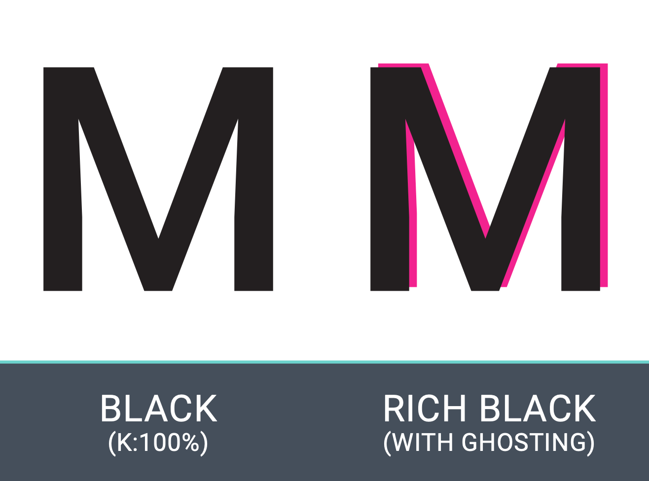
How do I avoid ghosting in printing?
Ghosting occurs when faint, blurry remnants of printed colors appear around the edges of text or fine details. This issue typically happens when using rich black for small text or line art. Because rich black requires all four ink plates to align perfectly, slight misalignment can cause ghosting.
Here’s how to avoid ghosting:
• Use standard black for text: Set small text, line art, or detailed graphics to 100% black (K) or grayscale instead of rich black (CMYK).
• Avoid rich black for fine details: Reserve rich black for large areas like backgrounds or bold design elements.
What is upsampling in printing?
Upsampling means artificially increasing an image's resolution. While it might seem like a quick fix for images 100 dpi or under, upsampling doesn’t add detail or quality. Instead, it enlarges pixel size, giving printed images a pixelated appearance. The best approach is to always start with a high-resolution image (ideally 300 dpi) to maintain quality and ensure your prints look sharp and professional.
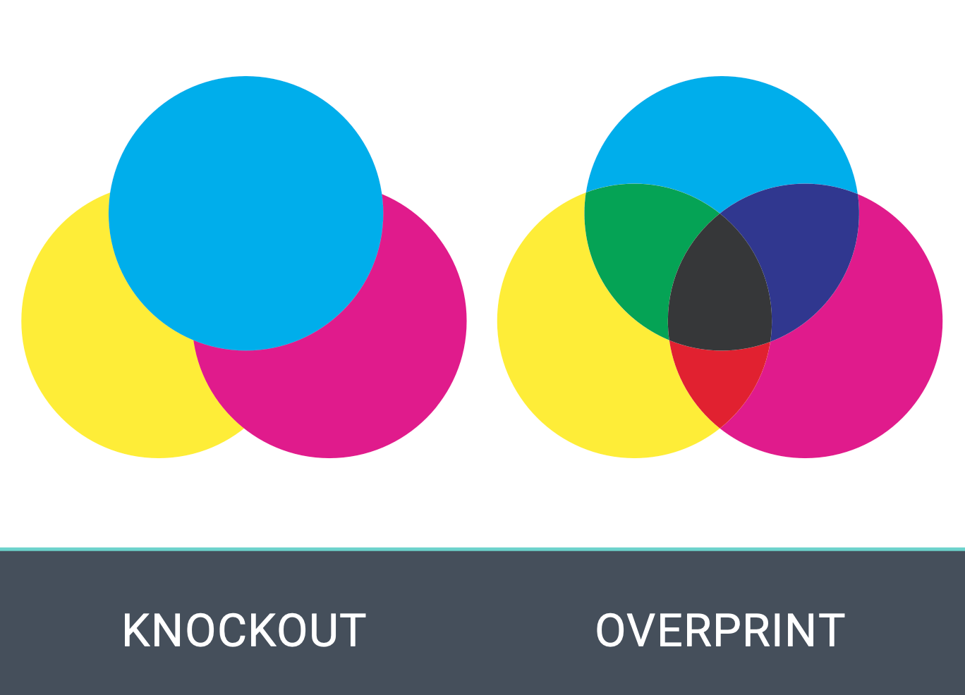
What is overprinting?
Overprinting refers to printing one color directly over another, causing them to mix. While some use overprinting intentionally to achieve layered or overlapping effects, it can lead to unexpected results if left unchecked. For example, black text or design elements set to overprint on a light background can appear as intended, but when placed on a darker or colored background, the underlying color may show through.
Here’s how to avoid overprinting issues:
• Enable ‘Overprint Preview’: Set it to ‘Always’ in your design program to see how colors will interact before printing.
• Double-check file settings: Review all text and design elements to ensure overprinting is only applied where needed.
• Avoid overprinting for small text and fine details: Use ‘Knockout’ for high-grade color reproduction. Knockout means an underlying color is removed or ‘punched out’ to prevent it from mixing with the overlaid color so the final colors remain distinct (e.g., yellow text over a blue background without appearing green in print).
• Set black text to overprint: Overprinting is helpful for black text, but ensure it’s applied intentionally.
How do I avoid font issues in print?
Choosing the right fonts is key to ensuring text appears sharp and clear in print.
Here are some tips to help avoid font-related issues:
• Choose print-compatible fonts: Avoid web fonts (optimized for digital screens). These fonts may not print correctly and can cause issues that are not visible during proofing.
• Embed fonts: Always embed any fonts you use to ensure they print as intended.
• Convert fonts to outlines: If you use a custom or web font, convert them to outlines or shapes so the text remains consistent. Save a copy of your original file before converting your fonts to outlines, as the font will no longer be editable once converted.
• Avoid rasterizing text: Rasterizing fonts (turning them into pixelated images) can cause them to lose sharpness and clarity in print. Keep text in vector format for the best results.
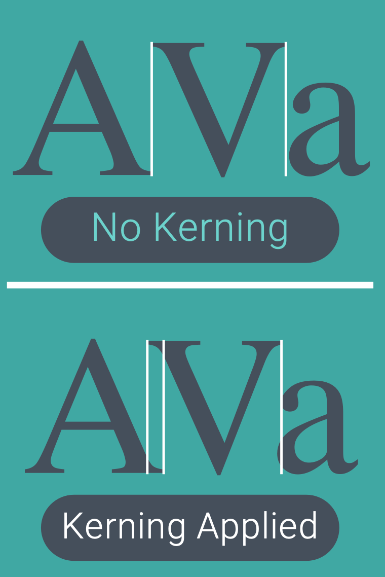
What is kerning in printing?
Kerning refers to the spacing between individual characters in a word. Proper kerning ensures evenly-spaced letters. If the spacing is too tight or loose, it can make your text look uneven or illegible in print.
Here’s how to avoid kerning issues:
• Check for uneven spacing: Look closely at the spacing between characters, especially in larger text or headers and edit accordingly.
• Use auto-kerning: Most design programs offer automatic kerning tools to adjust characters' spacing.
• Manually adjust kerning: Consider changing the kerning yourself, especially when working with custom fonts.
• Avoid tight spacing: Be especially careful with characters like ‘A’, ‘V’, or ‘T’ as they may need more room to look properly spaced out in print.
Now that you know how to achieve high-quality printing, let's take you through Ordering with Mixam.